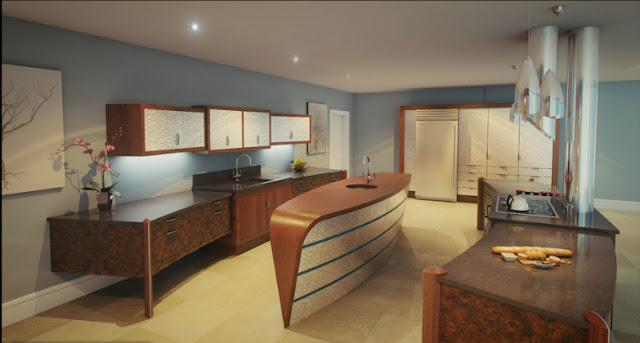
Okay kitchen design enthusiasts welcome to 2012 and what a great way to start a blisteringly good year of design than to focus your retina on this little beauty from Splinterworks!
This design is opulently dressed in a mix of American black walnut, Californian burr walnut; teak and silver leaf and is a showcase of how deep pockets and a vivid imagination can deliver something really special.
The Mogul’s initial reaction on seeing this design was to think that it was in-fact Flash Gordon’s Art Deco kitchen! There was also the lingering question about whether or not the addition of a very artistic second island between the cooking zone and the back wall would cause a functional obstruction!
Upon further consideration it becomes obvious that the second kitchen island enhances the usability and allows the design to achieve perspective against the expansive architecture! The slender design and central position of this island creates a natural and unobtrusive flow allowing the gastronomic engineers to bounce from the tall units positioned on either side of the room, gathering what they need and choosing a functional lane, left or right of the island dependent upon the activity they are involved in! This culinary relay also provides ample opportunity for sociability and functionally to collide, creating the perfect mix for intimate conversation and large social gatherings!
Cladding the large structural column in the centre of the room with polished mirror and using the custom extraction as a functional camouflage is brilliant and one that Flash would approve of!
The Mogul can also see that this design is a melting pot, an amalgamation of kitchen design influences! Not only can you see Splinterworks own unique style but by looking closely you can also see subtle influence coming from 2 elder Statesmen of kitchen design!
The Mogul approves!


Super cool! I can see the modern flair and also a bit a retro. Love the wall color - soothing for the office. Tapered edges on the island are brilliant!
ReplyDeleteHi Donna, this design certainly catches the eye and oozes the modern/ retro feel! The Mogul loves it. Thanks for popping by again!
ReplyDelete