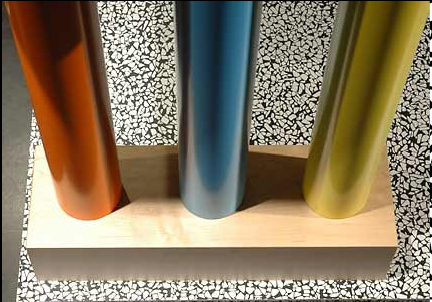
This concept by Eggersmann is so different The Mogul feels it deserves a closer look!
This kitchen uses vibrant colours and diverse patterns to present a disjointed but truly brilliant picture. Although the choice of colours and textures seems to be erratic they are carefully chosen to make up this Picasso type design. You only have to look at the handles on the island to discover that this is a calculated approach.
The Mogul approves!
Ask yourself this...how would it look if you had a hangover?


This appeared in the Designer magazine at the end of 2006. It's more Memphis than Picasso don't you think?
ReplyDelete